


A Flutter-first implementation of the vercel-labs/json-render concept.
flutter_json_render renders flat JSON specs into Flutter widgets through an explicit registry and catalog.
Quick links:
- Package: pub.dev/flutter_json_render
- Source: github.com/Dev-Beom/flutter-json-render
- Example app:
/example
- Guardrailed component/action model
- Flat and model-friendly spec shape (
root + elements) - Dynamic prop resolution (
$state,$item,$index,$cond) - Visibility and repeat support
- Style presets and style-aware prompt generation
- Custom style creation from JSON tokens
- JSONL streaming patch compiler for progressive UI updates
flutter pub add flutter_json_render- Core Concepts
- Quick Start
- Custom Styles
- Stream JSONL Patches
- Validate Specs
- Built-In Components
- Example App
- Security Scanning
JsonCatalog: declares what components/actions are allowedJsonRegistry: maps component type -> Flutter widget builder, action -> handlerJsonRenderer: rendersJsonRenderSpecsafelyJsonSpecStreamCompiler: compiles streamed JSONL specs/patchesJsonStyleDefinition: defines selectable style presets for generation/runtime
import 'package:flutter/material.dart';
import 'package:flutter_json_render/flutter_json_render.dart';

final catalog = JsonCatalog(
  components: {
    ...standardComponentDefinitions,
    'Panel': const JsonComponentDefinition(
      description: 'Simple card container',
      props: {
        'title': JsonPropDefinition(type: 'string', required: true),
      },
    ),
  },
  actions: {
    ...standardActionDefinitions,
    'increment': const JsonActionDefinition(description: 'Increase count'),
  },
  styles: {
    'clean': const JsonStyleDefinition(
      displayName: 'Clean',
      description: 'Neutral and productivity-focused',
      guidance: 'Use subtle borders and restrained color.',
    ),
    'midnight': const JsonStyleDefinition(
      displayName: 'Midnight',
      description: 'Dark, high-contrast dashboard style',
      guidance: 'Use compact spacing and bright accents.',
    ),
  },
);

final registry = defineRegistry(
  components: {
    ...standardComponentBuilders(),
    'Panel': (ctx) => Card(
      child: Padding(
        padding: const EdgeInsets.all(12),
        child: Column(
          crossAxisAlignment: CrossAxisAlignment.start,
          children: [
            Text(ctx.props['title']?.toString() ?? 'Panel'),
            const SizedBox(height: 8),
            ...ctx.children,
          ],
        ),
      ),
    ),
  },
  actions: {
    'increment': (ctx) {
      ctx.setStateModel((prev) {
        final next = <String, dynamic>{...prev};
        next['count'] = ((prev['count'] as num?) ?? 0) + 1;
        return next;
      });
    },
  },
);

final spec = JsonRenderSpec.fromJson({
  'root': 'panel',
  'state': {'count': 1},
  'elements': {
    'panel': {
      'type': 'Panel',
      'props': {'title': 'Counter'},
      'children': ['value', 'button'],
    },
    'value': {
      'type': 'Text',
      'props': {'text': {'$state': '/count'}},
    },
    'button': {
      'type': 'Button',
      'props': {'label': 'Increment'},
      'on': {
        'press': {'action': 'increment'}
      }
    }
  }
});

Widget app() {
  return MaterialApp(
    home: Scaffold(
      body: Center(
        child: JsonRenderer(
          spec: spec,
          registry: registry,
          styleId: 'clean', // runtime-selected style
        ),
      ),
    ),
  );
}
Generate style-aware LLM prompts:
final prompt = catalog.prompt(
  options: const JsonPromptOptions(
    selectedStyleId: 'clean',
    includeStyles: true,
  ),
);JsonStyleDefinition now supports JSON round-tripping and token maps:
final customStyle = JsonStyleDefinition.fromJson({
  'displayName': 'Aurora',
  'description': 'Cool dark surface with cyan accents',
  'guidance': 'Prefer high contrast and compact spacing.',
  'tokens': {
    'accent': '#22D3EE',
    'panelBackground': '#0B1220',
    'textPrimary': '#E0F2FE',
  },
});

final catalog = baseCatalog.withStyle('aurora', customStyle);
Bulk import style maps from API/LLM output:
final catalog = baseCatalog.withStylesFromJson({
  'aurora': {
    'displayName': 'Aurora',
    'description': 'Cool dark surface with cyan accents',
    'guidance': 'Prefer high contrast and compact spacing.',
    'tokens': {
      'accent': '#22D3EE',
      'panelBackground': '#0B1220',
      'textPrimary': '#E0F2FE',
    },
  },
});
See full style authoring guide:
final compiler = JsonSpecStreamCompiler();

compiler.push('{"root":"root","elements":{"root":{"type":"Text","props":{"text":"loading"}}}}\n');
compiler.push('{"op":"replace","path":"/elements/root/props/text","value":"ready"}\n');

final spec = compiler.getResult();
Supported stream line shapes:
- full spec object
- single patch op object
- patch op array
- wrapped patch object:
{ "patch": [ ... ] }
final result = validateSpec(spec, catalog: catalog, strictCatalog: false);
if (!result.isValid) {
  for (final issue in result.issues) {
    debugPrint('[${issue.severity}] ${issue.message}');
  }
}TextColumnRowContainerCenterSizedBoxButtonImage
Row overflow strategy:
overflow: "row"(default): normalRowoverflow: "wrap": usesWrapto avoid horizontal overflowoverflow: "scroll": horizontal scroll container
Example:
{
  "type": "Row",
  "props": {
    "spacing": 8,
    "runSpacing": 8,
    "overflow": "wrap"
  },
  "children": ["a", "b", "c"]
}A full multi-scenario showcase app is included in /example:
cd example
flutter run
Included scenarios:
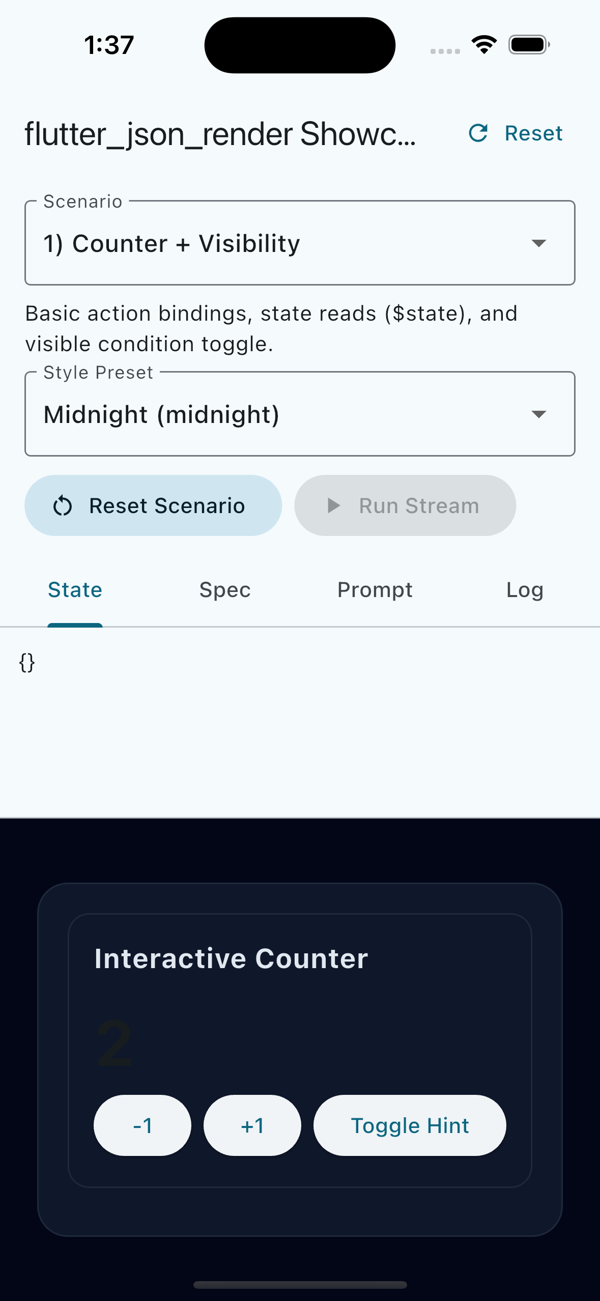
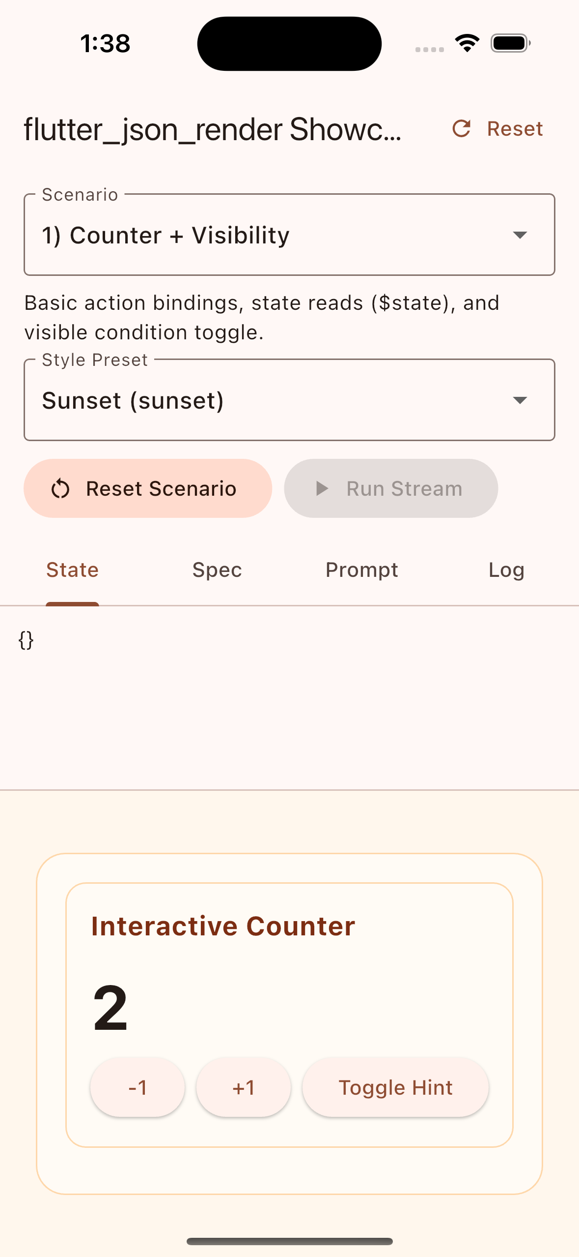
- Counter + visibility conditions
- Repeat +
$item/$indexactions - Dynamic props via
$cond - Async action flow
- Streamed JSONL patch simulation
- Chat-like stream build-up
- Streamed multi-component build-up (
Text,Row,Column,Container,Center,SizedBox,Button, custom components)
The example includes a Style Preset dropdown and supports startup style selection:
cd example
flutter run --dart-define=STYLE_PRESET=midnight
You can also add a custom style at runtime:
- Click
Add Custom Styleand paste a style JSON object. - Or boot with
CUSTOM_STYLE_JSON:
cd example
flutter run \
  --dart-define=STYLE_PRESET=sunset \
--dart-define=CUSTOM_STYLE_JSON='{"id":"aurora","base":"midnight","displayName":"Aurora","description":"Deep blue surface with bright cyan accents.","guidance":"Use high contrast and cool accent colors.","tokens":{"accent":"#22D3EE","panelBackground":"#0B1220","textPrimary":"#E0F2FE"}}'| clean | midnight | sunset |
|---|---|---|
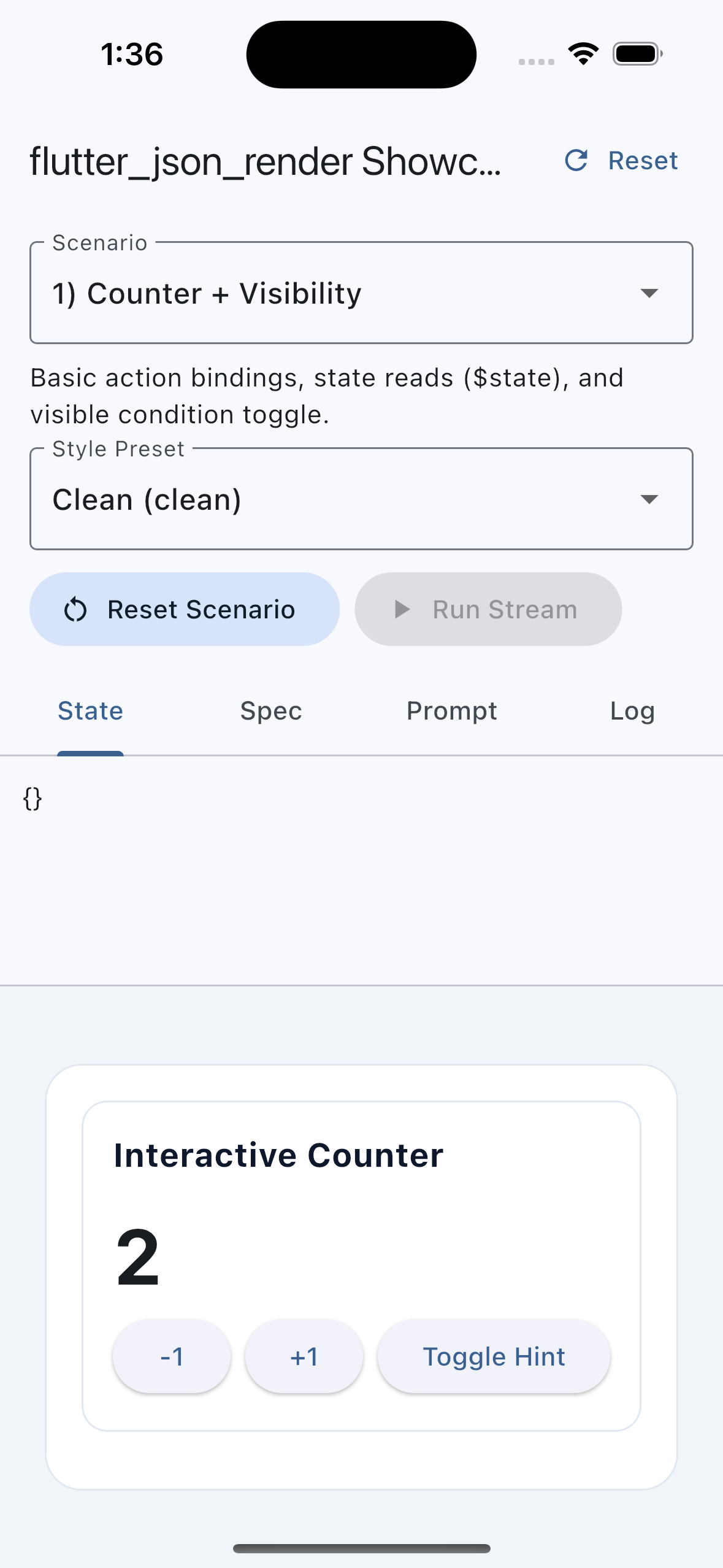 |
 |
 |
JSONL patch stream progressively builds a component-rich interface:
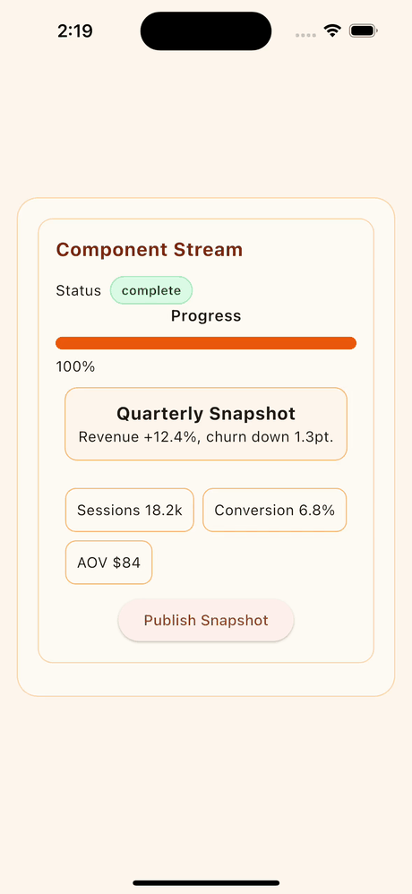
Replay the same capture scenario locally:
cd example
flutter run \
  --dart-define=STYLE_PRESET=sunset \
  --dart-define=SCENARIO=component_stream \
  --dart-define=AUTO_RUN_STREAM=true \
  --dart-define=AUTO_RUN_DELAY_MS=2200 \
  --dart-define=STREAM_STEP_DELAY_MS=620 \
--dart-define=CAPTURE_MODE=trueflutter analyze
flutter test
dart pub publish --dry-runGitHub Actions secret scanning is enabled with both gitleaks and trufflehog.
- Workflow:
.github/workflows/secret-scan.yml - Runs on pull requests, pushes to
main, weekly schedule, and manual dispatch
MIT